Esri’s call-to-action Redesign and Strategy
What is it?
A design system to optimize conversions and increase the visibility of “try”, “buy” and “contact us” options on 180 Esri product pages, as well as provide consistency across all pages.
Challenge
Esri needed to unify its calls to action, across its product eco-system. There was an increase in reports of user frustration when purchasing software or getting help with their account or technical support. This was beginning to affect the company’s bottom line. We needed a comprehensive and scalable solution to combat this.
These are two similar products, that essentially do very similar things. They were created at different times, and their calls-to-action are drastically different.
The scale of the issue
This issue was magnified over 180 micro-sites and 300+ individual pages.
Business objectives
Increase conversion rates of first-time visitors to the site by 15-20%.
Standardize Esri's product pattern around trying and buying the product.
Increase a user’s ability to get help with technical support, or their Esri account.
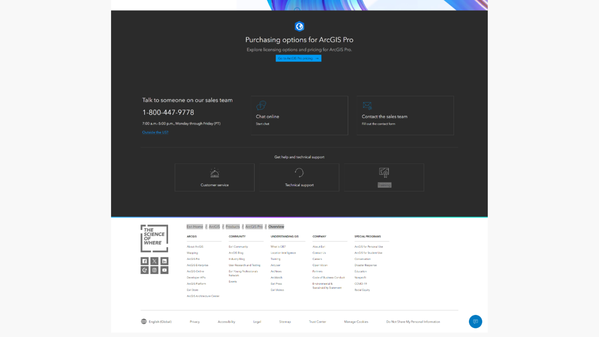
Some of the final designs
Results
This initiative helped us increase our conversion rates by 30%, and decrease our cart abandonment rate by 20%.
Process
I Interviewed 10 users to discover pain points, when contacting Esri, or buying our products.
Findings
Consistency of contact options inspires trust in the brand and makes them more likely to convert.
Users have certain expectations, about what should be at the bottom of a product page. When things are missing, they become frustrated.
Basic contact options, like, chat, phone number and email should be visible on every page. Help options should also be visible.
Sharing findings with stakeholders
From user interviews, I was able to cultivate multiple personas. These were brought into meetings to communicate pain-points broadly, with stakeholders.
Team collaboration
I collaborated with stakeholders to plan how to enact change in our calls-to-action, prioritizing both user and business needs.
Some high priority items
Hierarchy of the CTA container.
How to prioritize buying, and trying options throughout the page, and within the Call-to-action container.
How to best surface contact and help options.
Sitewide audit and classifications of Calls-to-action
I identified all the elements that create calls-to-action, Across Esri Product pages including page elements, Adobe Experience Manager components, and elements within the components across 3 primary areas: channel, business unit, and copy.
Audit Findings
There were 3 primary ways to buy products on Esri.com
I turned these into easy-to-understand cards, that call out the core elements of each type of product, in our ecosystem. These were incredibly helpful when communicating to content writers and engineers.
Design
Personalization
In addition to catering to different product types and scenarios, I also designed variants based on whether or not someone was a net-new user, or a returning one OR actions they might have previously completed.
For first-time users we focused on prioritizing contact options, while for returning users, we prioritized ways to find help
I played around with exposing newsletter sign-up, for first-time users, but stripped it away, for returning users, but ultimately decided against it.
Prototyping and testing
One piece of feedback we got right away, was that the forms made pages too long, especially on mobile.
We got rid of some on product pages but couldn’t on all.
Post-launch results
We launched the CTA’s across 4 flagship products.
How to communicate:
With high-level stakeholders. Most of whom wanted to be present for design conversations.
What I Learned
The power of iteration:
We had a heads-down approach to designing. We threw every idea at the wall to see which ones stuck.
When to pivot:
We had a lot of 11th-hour changes that were out of our control. This meant I had to do a lot of iterations on the fly, while working with our FED team.


